Module 9 · Excel for Data Analysis
Charts and visualization
Build clear line, bar and combo charts from pivot tables, and use conditional formatting and sparklines to make tables readable.
About 35 minutes
The problem
The pivot tables show the numbers, but a table of 18 months × 6 regions doesn't jump out at anyone. The sales director needs to see the December peak, the Lagos growth and the North West fall. Excel can chart all of it, but its defaults need work before a chart is fit for a meeting.
The concept
Pick the chart from the question (as in Data Analytics Foundations):
| Question | Excel chart |
|---|---|
| Trend over time | Line |
| Compare categories | Clustered bar (horizontal) or column |
| Parts of a whole, 2–4 parts | 100% stacked bar, or a donut |
| Two measures with different scales | Combo (column + line on a secondary axis), sparingly |
PivotCharts (PivotTable Analyze → PivotChart) are linked to the pivot: filter or slice the pivot and the chart follows.
Fix the defaults, every time
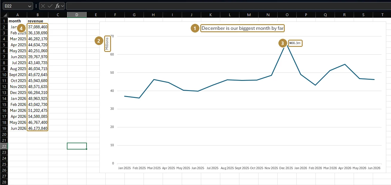
- Title that states the finding: click the title and type, e.g. "December is our biggest month by far".
- Delete what doesn't help: legend for a single series, heavy gridlines, field buttons on PivotCharts (right-click → Hide All Field Buttons).
- Axis: bars start at 0; format numbers as millions. In Format Axis, set Display units to Millions.
- Colour: one colour for everything, one accent for the point you're making.
- Sort bars largest to smallest (sort the pivot and the chart follows).
Tables can be visual too
- Conditional formatting → Data Bars puts a small bar in each cell.
- Color Scales shade high and low values.
- Sparklines (Insert → Sparklines → Line) draw a tiny trend chart inside one cell: good for a row per region.
Example
Monthly revenue line chart: pivot with order_date grouped into Years and Months in Rows and revenue in Values, then PivotChart → Line. The chart shows a steady ₦36–49m a month in 2025, a spike to ₦66.3m in December 2025, then a higher base of ₦43–55m a month in 2026 after the January price rise.
Category bar chart for one month: category in Rows, revenue in Values, order_date filtered to December 2025, sorted descending, as a clustered bar.
Walkthrough
- Build the monthly pivot described above.
- Click inside it → PivotTable Analyze → PivotChart → Line → OK.
- Right-click a field button on the chart → Hide All Field Buttons on Chart.
- Click the legend → Delete (one series doesn't need one).
- Double-click the vertical axis → Display units: Millions; tick Show display units label.
- Click the chart title and write the finding.
- Click the December 2025 point twice (to select just that point) → Add Data Label.
The result, built on Kolanut's monthly revenue:
Then, for the regional table, select the H1 2026 revenue column → Home → Conditional Formatting → Data Bars → Solid Fill.
Shortcuts for charts
| Keys | Does |
|---|---|
| Alt + F1 | Insert the default chart next to the selected data |
| F11 | Insert a chart on its own sheet |
| Ctrl + 1 | Open the Format pane for the selected chart element |
| Alt, N, R | Recommended Charts |
Practice
Practice
Which product category had the highest revenue in December 2025?
Practice
Looking only at 2026, which month had the highest revenue? (Just the month name.)
Check your understanding
Answer every question to check.