Module 10 · Power BI Fundamentals
Visualizations
The visuals you'll use most, how to configure and format them, and how visuals interact on a page.
About 35 minutes
The problem
Your model and measures are ready. Now they need to become a page someone can read. Power BI has dozens of visuals; a handful do most of the work, and knowing how they interact (click one bar, and the whole page filters) is what makes a report feel alive.
The concept
The core visuals
| Visual | Best for | Wells to fill |
|---|---|---|
| Card | One headline number | Fields: a measure |
| Clustered bar / column | Comparing categories | Y-axis (category), X-axis (measure) |
| Line chart | Trends over time | X-axis: Date[Year Month] or Date hierarchy; Y-axis: measures |
| Matrix | Cross-tab (like a pivot table) | Rows, Columns, Values |
| Table | Detail lists | Columns |
| Slicer | On-page filtering | Field: a dimension column |
| Line and clustered column | Two measures with different scales | Column y-axis, Line y-axis |
Formatting (Format visual, paintbrush icon): titles, data labels, axis units (Millions), colours. For a single highlighted bar: Format → Bars → Colors → turn on Show all and colour one category.
Conditional formatting in tables and matrices: click the field's drop-down in the Values well → Conditional formatting → Background color / Data bars / Icons.
Interactions. Clicking a data point in one visual cross-filters or cross-highlights the others. Control it: select a visual → Format → Edit interactions, then choose filter, highlight or none on each other visual.
Drill down. With a hierarchy (Year → Quarter → Month) on an axis, the drill arrows at the top of the visual move between levels.
Tooltips. Hovering shows details; add extra measures to the Tooltips well to show more (e.g. YoY % when hovering a region's bar).
Example
A first report page for Kolanut:
- Top row: three Cards:
Revenue,YoY %,Active Customers. - Left: Line chart:
Date[Year Month]on the X-axis,RevenueandRevenue LYon the Y-axis. - Right: Clustered bar:
customers[region]on the Y-axis,Revenueon the X-axis,YoY %in Tooltips, sorted descending. - Bottom: Matrix:
products[category]in Rows,Date[Year]in Columns,Revenuein Values, with data bars. - Side: Slicers for
customers[channel]andDate[Year].
Click the North West bar and every other visual shows North West only.
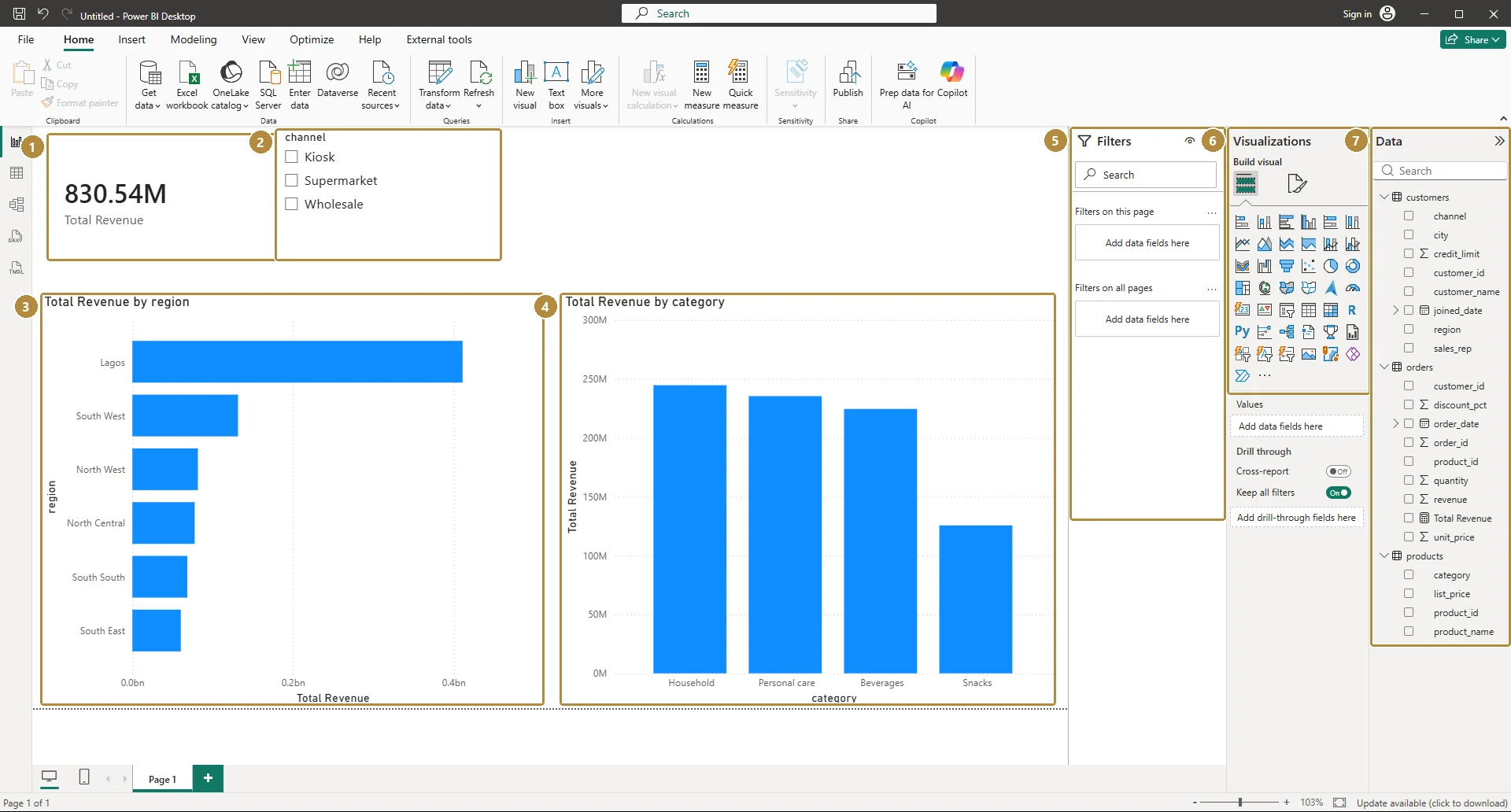
Here's a first version of that page built in Power BI Desktop, with a card, a slicer and two bar charts:
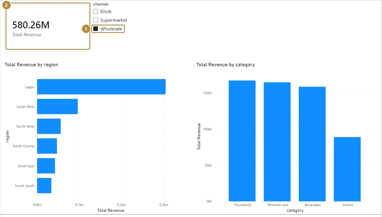
Tick Wholesale in the slicer and every visual on the page recalculates for wholesale customers only:
Walkthrough
- Add the three cards. For each, Format → Callout value → Display units Millions for revenue.
- Add the line chart. If the X-axis shows a hierarchy (Year, Quarter, Month, Day), use
Date[Year Month]instead, or drill down to Month. - Add the region bar chart; sort by Revenue (… menu → Sort axis → Revenue, descending).
- Add the matrix with data bars on Revenue.
- Add slicers; set their style to Tile or Dropdown (Format → Slicer settings).
- Click around. Then select the line chart → Format → Edit interactions and set the region bar chart to filter rather than highlight the line chart.
Practice
Practice
Click North West in the region bar chart with the Year slicer set to 2026. What does the Revenue card show, to the nearest naira?
Practice
In the category-by-year matrix, what was Snacks revenue in 2025, to the nearest naira?
Check your understanding
Answer every question to check.